

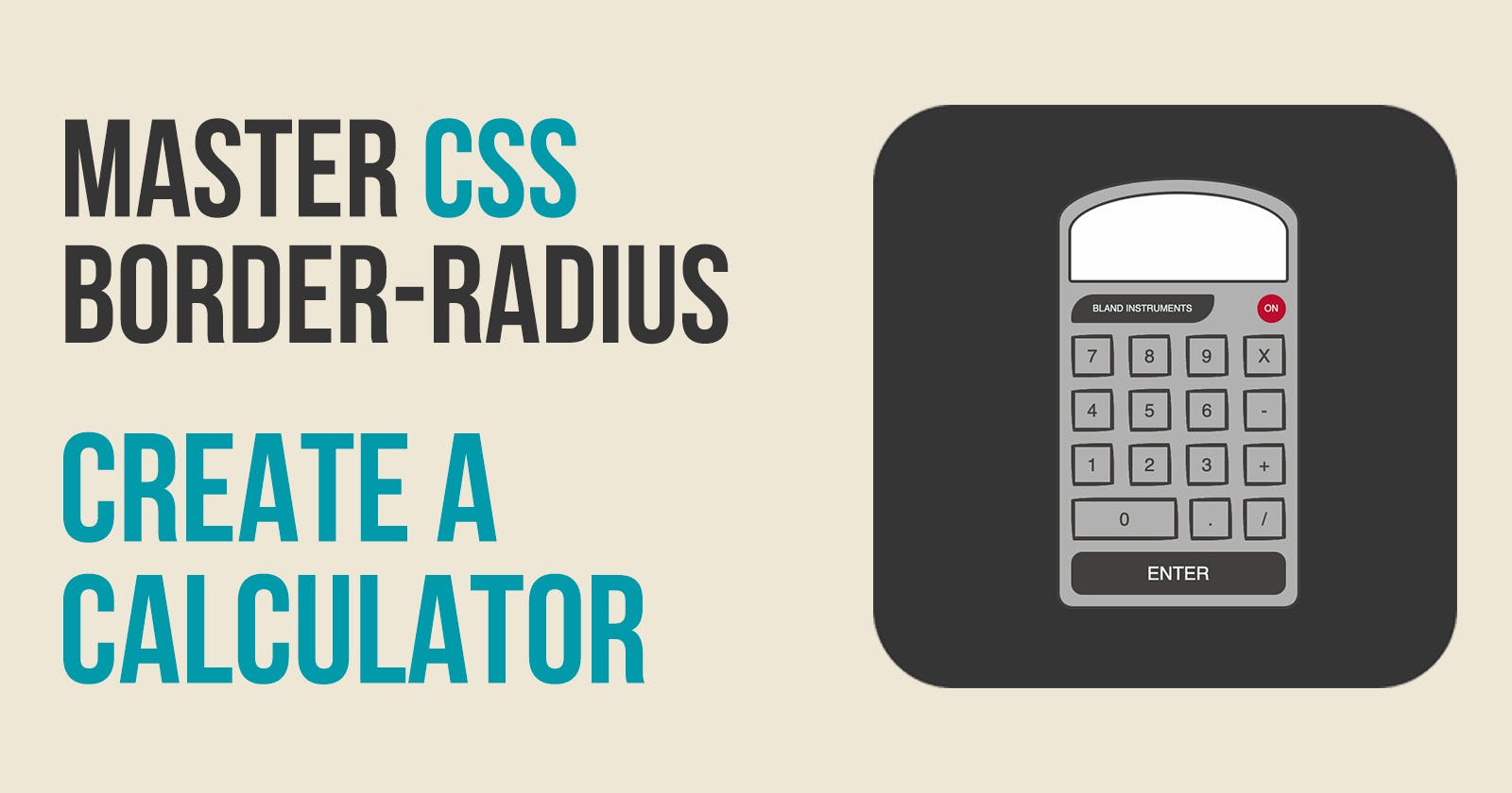


One of the best ways to learn CSS is by creating something useful while you learn. I will show you how to master the CSS border-radius property to create a calculator.
What We Will Be Creating
Create Our Starter Files
Let's start by creating two files called index.html and style.css. In your index.html file add the following starter code:
<!DOCTYPE html>
<html lang="en">
<head>
    <meta charset="UTF-8">
    <meta http-equiv="X-UA-Compatible" content="IE=edge">
    <meta name="viewport" content="width=device-width, initial-scale=1.0">
    <title>Calculator</title>
    <link rel="stylesheet" href="style.css">
</head>
<body>

</body>
</html>
In the style.css file add the following starter code:
body{
  padding: 0;
  margin: 0;
  height: 100vh;
  display: flex;
  justify-content: center;
  align-items: center;
  background-color: wheat;
}
Dissecting the Calculator
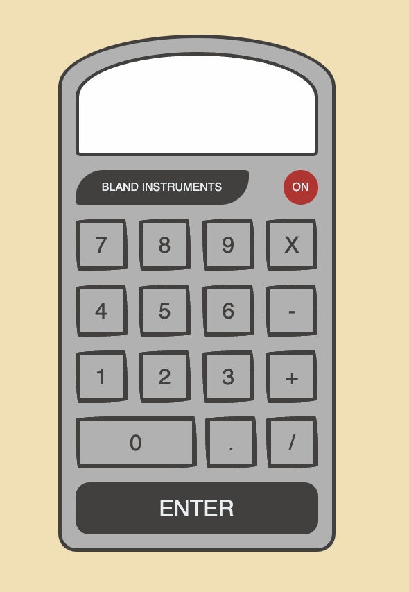
Earlier I showed you a picture of the calculator we will create. Let's think of what is needed to create it.
To start we will need a frame. Every part of the calculator will fit inside this frame.
Starting from the top of the calculator and going to the bottom we have:
a result frame
a row with the logo and the
onbuttona row with the buttons
7,8,9,Xa row with the buttons
4,5,6,-a row with the buttons
1,2,3,+a row with the buttons
0,.,/a row with the
enterbutton
We will be using Flexbox. For the calculator frame, we will be displaying the contents using a column layout. For the button, we will be using a row layout.
Inside the body tag in your index.html file add the following code:
<div class="calc-frame">
     <div class="calc-result-frame"></div>
     <div class="flex-row">
          <div class="calc-logo">BLAND INSTRUMENTS</div>
          <div class="calc-on">ON</div>
     </div>
     <div class="flex-row">
          <button class="calc-btn">7</button>
          <button class="calc-btn">8</button>
          <button class="calc-btn">9</button>
          <button class="calc-btn">X</button>
     </div>
     <div class="flex-row">
          <button class="calc-btn">4</button>
          <button class="calc-btn">5</button>
          <button class="calc-btn">6</button>
          <button class="calc-btn">-</button>
     </div>
     <div class="flex-row">
          <button class="calc-btn">1</button>
          <button class="calc-btn">2</button>
          <button class="calc-btn">3</button>
          <button class="calc-btn">+</button>
     </div>
     <div class="flex-row">
          <button class="calc-btn flex-double">0</button>
          <button class="calc-btn">.</button>
          <button class="calc-btn">/</button>
     </div>
     <div class="flex-row">
     <button class="calc-btn calc-enter">ENTER</button>
     </div>
</div>
We will go through and style all of the above elements using the CSS border-radius property. But before we get started we need to add some styling for the frame of our calculator. Add the following code to your style.css file:
.calc-frame {
    display: flex;
    flex-direction: column;
    align-items: center;
    justify-content: center;
    width: 375px;
    padding: 20px;
    border: solid 5px #41403E;
    background: #b1b1b1;
}
Styling our Rows
The buttons on the calculator are grouped together in a row. We need to use Flexbox to style this row.
Add this code to your style.css file:
/*****************************
*       Flex Styles         *
/****************************/
.flex-row {
    display: flex;
    flex-direction: row;
    width: 100%;
    justify-content: space-between;
    align-items: center;
    margin-top: 20px;
}
.flex-double {
    width: 50%;
}
What is the border-radius property
The border-radius CSS property rounds the corners of an element's outer border edge. You can set a single radius to make circular corners, or two radii to make elliptical corners.
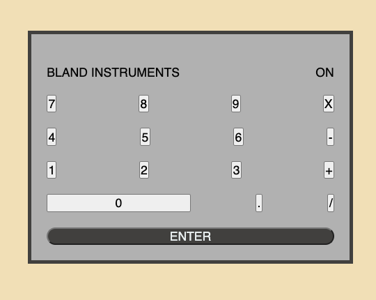
Styling the Enter Button
Let's create our first example by styling the enter button. The button has a brown background with white text. We want the button to extend the full length of the calculator frame.
We want all four corners of the button to be curved. We will use the border-radius property with a value of 20px.
Add the following code to your style.css file:
.calc-enter {
    background: #41403E;
    color: #e8eff0;
    border-radius: 20px;
    width: 100%;
}
This is what our calculator looks like now:
Styling the On Button
Every element in CSS is a box. It has a top, right, bottom, and left side of that box. For the enter button, we styled all four corners to be the same size. We can make a circle by setting the border radius to 50% while setting the height and width to have the same value.
Add the following code to your style.css file:
.calc-on {
    border-radius: 50%;
    background: #BA0C2F;
    color: #e8eff0;
    width: 50px;
    height: 50px;
}
If you look at your calculator, you will notice the text ON is not in the center of the circle.
Let me share a great trick to center text both horizontally and vertically inside an element. It starts with centering the text horizontally by using the text-align property and setting it to center. Now to center the text vertically set the line-height to be the same height as the element.
Add these 2 lines to your calc-on style:
    text-align: center;
    line-height: 50px;
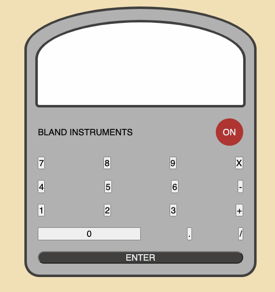
Styling the Calculator and Result Frame
The frame for our calculator and the frame for the results have an arch at the top and the bottom has a curved radius.
In the previous 2 examples, we styled all four corners of the element to be the same. It is possible to style each corner individually. To do that you would use the properties;
border-top-left-radius
border-top-right-radius
border-top-right-radius
border-top-right-radius
When you use the individual properties you specify the radius of the ellipse defining the curvature of the corner. The rounding can be a circle or an ellipse.
To make it an ellipse you provide 2 values for the individual border-radius property.
We already have an entry in the style.css file for .calc-frame. Add the following code to that class:
    border-top-left-radius: 270px 100px;
    border-top-right-radius: 270px 100px;
Our calculator frame has the arch look at the top.
Next, we need to style the bottom corners. To do that we provide a single value to the individual border-radius properties for the bottom corners.
Add the following code to the .calc-frame:
    border-bottom-right-radius: 35px;
    border-bottom-left-radius: 35px;
Now our calculator frame looks perfect. We want to use the exact same styling for the .calc-result-frame. Add the following code to your style.css file:
.calc-result-frame {
    background: #fefefe;
    border: solid 5px #41403E;
    width: 100%;
    height: 150px;
    border-top-left-radius: 270px 100px;
    border-top-right-radius: 270px 100px;
    border-bottom-right-radius: 10px;
    border-bottom-left-radius: 10px;
}
This is what our calculator looks like now:
Styling Our Logo
In styling our calculator frame we learned that you can specify two values for the border-radius to make a rounding that is an ellipse. We will do this for each of the four corners.
Add the following code to your style.css file:
.calc-logo {
    background: #41403E;
    color: #e8eff0;
    border-radius: 40px 5px;
    width: 250px;
    height: 50px;
}
This gives us a unique border for our logo but notice that the title is not centered inside the logo. Let's use the trick I shared earlier on how to center text vertically and horizontally.
Add the following code to .calc-logo:
    text-align: center;
    line-height: 50px;
Styling our Buttons
The last thing we need to include is the styling for each of the buttons on our calculator. I want the buttons to look like they are hand drawn.
To do this we need to specify each corner to be styled as an ellipse which means we need to provide two values for each corner. There is a short-hand way of doing this by using border-radius to specify the first value for each of the four corners and then have a / value followed by the second value for each of the four corners.
Add the following code to your style.css file:
.calc-btn {
    background: transparent;
    color: #41403E;
    font-size: 2rem;
    width: 75px;
    height: 75px;
    border-radius: 255px 15px 225px 15px/15px 225px 15px 255px;
    border: solid 7px #41403E;
}
Final Calculator
If you view your index.html file in a browser, you should see the completed calculator:
Let's Connect
Thanks for reading my article today. You can get the source code here.
If you like my content, please consider buying me a coffee ☕.