One of the best ways to learn CSS is by creating something useful while you learn. I will show you how to use the following CSS items by creating the Netflix logo:
border-left and border-right
pseudo class ::before
box-shadow
transform: skewX
What we will be creating
We will create the Netflix logo in pure CSS. It will look like this:

Create our starter files
Let's start by creating two files called index.html and style.css. In your index.html file add the following starter code:
<!DOCTYPE html>
<html lang="en">
<head>
    <meta charset="UTF-8">
    <meta http-equiv="X-UA-Compatible" content="IE=edge">
    <meta name="viewport" content="width=device-width, initial-scale=1.0">
    <title>Netflix Logo</title>
    <link rel="stylesheet" href="style.css">
</head>
<body>

</body>
</html>
In the style.css file add the following starter code:
body{
  padding: 0;
  margin: 0;
  height: 100vh;
  display: flex;
  justify-content: center;
  align-items: center;
  background-color: azure;
}
border-left and border-right
When you look at the Netflix logo it is basically 2 vertical lines that are joined by a third line.
When you create an element in CSS you can define whether or not that element has a border. Each element in CSS has four sides. You can define a border for all four sides or any combination of individual sides.
Looking at the Netflix logo, it appears like an element that has a border on the right and left sides. These borders are red and have the same width.
We will use the border-left and border-right properties to create the first part of our Netflix logo.
In your index.html file add the following line between the body tags:
<div class="netflix-logo"></div>
Now add this style to your style.css file:
.netflix-logo {
  height: 15rem;
  width: 3rem;
  border-left: 3rem solid #e50914;
  border-right: 3rem solid #e50914;
}
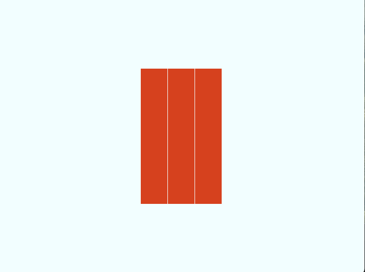
When you look at our logo in the browser you will see this:

Pseudo class ::before
In CSS, ::before creates a pseudo-element that is the first child of the selected element: It is often used to add cosmetic content to an element with the content property. It is inline by default.
We need to create a 3rd line for our Netflix logo. We only have one element to place a style against. To add the third line we will use the pseudo ::before class.
One thing to be aware of is that any element that is styled using the pseudo ::before class will be inline. This will not work because we need to have the element shown. To do that we will set the display property to be block.
We will set the height and width to 100% and the background to the red color we used for our borders.
Add the following code to your style.css file:
.netflix-logo:before {
  display: block;
  content: '';
  width: 100%;
  height: 100%;
  background: #e50914;
}
When you look at the logo now this is what you see:

transform: skewX
The transform CSS property lets you rotate, scale, skew, or translate an element. It modifies the coordinate space of the CSS visual formatting model.
One of the properties for transform is skewX. The skewX CSS function defines a transformation that skews an element in the horizontal direction on the 2D plane.
In plain English, we want this third line to lean to the left and connect the first two lines.
Add this style to the existing .netflix-logo:before:
transform: skewX(21.5deg);
Now when we look at our logo we see this:

box-shadow
Technically, we could stop here and say our logo is complete. But we don't settle for almost complete, do we?
The middle line in the Netflix logo has a shadow behind it. We will use the CSS box-shadowproperty to create this shadow.
The box-shadow CSS property adds shadow effects around an element's frame. A box shadow is described by X and Y offsets relative to the element, blur and spread radius, and color.
Add this final line to your .netflix-logo:before class in your style.css file:
box-shadow: 0 0 30px black;
Final Logo
If you view your index.html file in a browser. you should see the completed Netflix Logo:

Let's Connect
Thanks for reading my article today. You can get the source code here.
If you like my content, please consider buying me a coffee ☕.

