


One of the best ways to learn CSS is by creating something useful while you learn. I will show you how to use the following CSS items by creating the Google logo:
position relative and absolute
pseudo classes ::before and ::after
positioning an element that is absolute
transform: translateY
create triangle
What we will be creating
We will create the Google logo in pure CSS. It will look like this:

Create our starter files
Let's start by creating two files called index.html and style.css. In your index.html file add the following starter code:
<!DOCTYPE html>
<html lang="en">
<head>
    <meta charset="UTF-8">
    <meta http-equiv="X-UA-Compatible" content="IE=edge">
    <meta name="viewport" content="width=device-width, initial-scale=1.0">
    <title>Google Logo</title>
    <link rel="stylesheet" href="style.css">
</head>
<body>

</body>
</html>
In the style.css file add the following starter code:
body{
  padding: 0;
  margin: 0;
  height: 100vh;
  display: flex;
  justify-content: center;
  align-items: center;
  background-color: azure;
}
Dissecting the Google Logo
The Google logo is a multi-colored letter G. If we look at it closely it is basically a multi-colored circle with part of it removed and replaced with a line. Knowing that then we will use that in creating the Google logo.
Add the following line inside the body tag of your index.html file:
<div class="google-logo"></div>
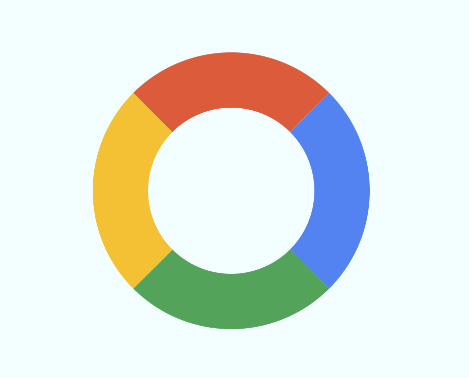
Creating our multi-colored circle
The first step in creating the Google logo is to create a multi-colored logo. This first step is to create a circle with a different color for each corner. For this demo, I am going to set the circle to have a height and width of 300px.
Add the following code to your style.css file:
.google-logo {
    position: relative;
    width: 300px;
    height: 300px;
    padding: 0;
    border-top: 100px solid #ea4335;
    border-right: 100px solid #4285f4;
    border-bottom: 100px solid #34a853;
    border-left: 100px solid #fbbc05;
    border-radius: 50%;
    background-color: azure;
}
This is what our logo looks like now:
Position absolute and relative
The position CSS property sets how an element is positioned in a document. The top, right, bottom, and left properties determine the final location of positioned elements.
If you define an element to have a position of absolute, the element is removed from the normal document flow, and no space is created for the element in the page layout. It is positioned relative to its closest positioned ancestor.
We defined the .google-logo to have position of relative. The next step in the logo is to create the line part of the letter G. This element will have a position of absolute.
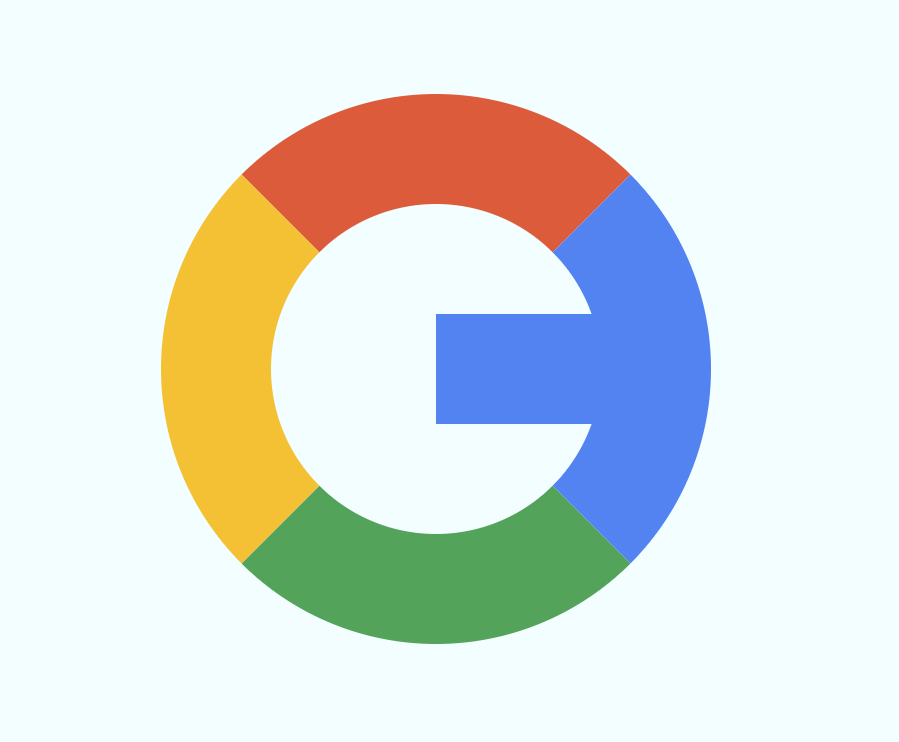
pseudo class ::before
We need to create the line part of the G letter. We will use the pseudo class :before to draw this line.
We will define the line to have a position of absolute. Then we will define its position by using the top and right properties.
We set the top to be 50%. That makes the top of the line to be at 50% of the circle. This puts the line below the center. This is not what we want. To move it to be in the center we will use a CSS trick using the transform property.
Add the following code to your style.css file:
.google-logo::before {
    content: "";
    position: absolute;
    top: 50%;
    right: -95px;
    transform: translateY(-50%);
    width: 245px;
    height: 100px;
    background-color: #4285f4;
}
This is what our logo looks like now:
Creating a triangle
The last step of our logo is to create a triangle above the line. This triangle will be transparent which will hide part of our original multi-colored circle.
Here is what we want to accomplish:

We will use the pseudo class ::after to draw the triangle. To make the triangle hide part of the circle we will give it the same background color as our body which is azure.
In a previous article about creating the YouTube logo, I showed how to create a triangle in CSS. We will be doing exactly the same here.
Add the following code to your style.css file:
.google-logo::after {
    content: "";
    position: absolute;
    top: -100px;
    right: -100px;
    width: 0;
    height: 0;
    border-top: 200px solid transparent;
    border-right: 200px solid azure;
}
Final Logo
If you view your index.html file in a browser, you should see the completed Google Logo:
Let's Connect
Thanks for reading my article today. You can get the source code here.
If you like my content, please consider buying me a coffee ☕.