One of the best ways to learn CSS is by creating something useful while you learn. I will show you how to use the following CSS items by creating the YouTube logo:
flexbox
border-radius
how to create a triangle in CSS
What we will be creating
We will create the YouTube logo in pure CSS. It will look like this:

Create our starter files
Let's start by creating two files called index.html and style.css. In your index.html file add the following starter code:
<!DOCTYPE html>
<html lang="en">
<head>
    <meta charset="UTF-8">
    <meta http-equiv="X-UA-Compatible" content="IE=edge">
    <meta name="viewport" content="width=device-width, initial-scale=1.0">
    <title>Youtube Logo</title>
    <link rel="stylesheet" href="style.css">
</head>
<body>

</body>
</html>
In the style.css file add the following starter code:
body {
    margin: 0;
    padding: 0;
    height: 100vh;
    display: flex;
    justify-content: center;
    align-items: center;
    background: azure;
}
Flexbox
We will be using flexbox to center our logo on the screen. Then we will use flexbox to also center the play button in the center of the red background.
Flexbox has a main axis and a cross axis. The main axis is the direction that the content is laid out. The default main axis in flexbox is the horizontal row. If you have the main layout to be column then the main axis is the vertical column.
To center items along the main axis, you use the flexbox property justify-content. To center items along the cross axis, you use the flexbox property align-items.
If you look at the starter code we put in our style.css file you will see that it sets both of these properties to the value of center. This centers our content in the middle of the screen. We want to center the play button in the middle of our red background.
Adding our code for logo
We need to add code to our index.html file for the red background and the play button. Add the following code inside the body tag:
    <div class="youtube-logo">
        <div class="playBtn"></div>
     </div>
border-radius
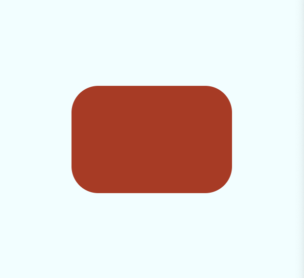
In previous articles, I have shown how to use border-radius to style all four edges of an element. For my red background, I want all four corners to have the same edge. To make all edges the same I will set the border-radius property to 50px.
Add the following code to your style.css file:
.youtube-logo {
    background-color: firebrick;
    width: 300px;
    height: 200px;
    border-radius: 50px;
    display: flex;
    justify-content: center;
    align-items: center;
}
This is what our code looks like now in the browser:
Create a triangle in CSS
CSS Tricks and Tips website has a great article on how to create a triangle in CSS. You can read the article here.
In that article, they provide the following CSS code for a triangle pointing to the right. This is exactly what we want for our play button. So I just copied their code and made one change - I changed the color of the triangle from green to white.
Add this code to your style.css file:
.playBtn {
    width: 0;
    height: 0;
    border-top: 60px solid transparent;
    border-bottom: 60px solid transparent;
    border-left: 60px solid white;
}
Updating our triangle
If you look at our logo now, the play button triangle has all sides to be the same length. It looks like this:

This is not really what I want. I want it to be longer and not have equal sides.
Luckily this can be easily fixed by changing one line. Update the border-left property to be this:
border-left: 120px solid white;
Final Logo
If you view your index.html file in a browser you should see the completed YouTube logo:

Let's Connect!
Thanks for reading my article today. You can get the source code here.
If you like my content, please consider buying me a coffee ☕.

