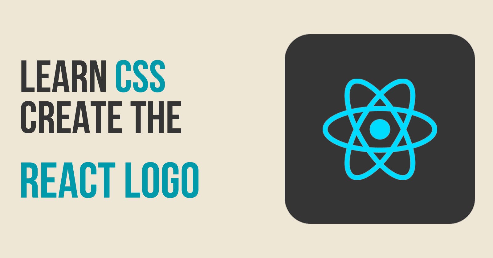
One of the best ways to learn CSS is by creating something useful while you learn. I will show you how to use the following CSS items by creating the React logo:
position: absolute
vw (view width)
transform: rotate()
animation using keyframes
What we will be creating
We will create the React logo in pure CSS. It will look like this:

Create our starter files
Let's start by creating two files called index.html and style.css. In your index.html file add the following starter code:
<!DOCTYPE html>
<html lang="en">
<head>
    <meta charset="UTF-8">
    <meta http-equiv="X-UA-Compatible" content="IE=edge">
    <meta name="viewport" content="width=device-width, initial-scale=1.0">
    <title>React Logo</title>
    <link rel="stylesheet" href="style.css">
</head>
<body>

</body>
</html>
In the style.css file add the following starter code:
body{
  padding: 0;
  margin: 0;
  height: 100vh;
  display: flex;
  justify-content: center;
  align-items: center;
  background-color: azure;
}
position: absolute
The position CSS property sets how an element is positioned in a document. If the value is absolute then the element is removed from the normal document flow, and no space is created for the element in the page layout.
The React logo consists of a center ball surrounded by 3 ellipses. We will use absolute positioning to have all of the items centered on the screen.
If we did not use position absolute then all elements of the logo - the ball and the 3 ellipses would be positioned side by side since we are using flexbox.
Adding our code for the logo
Add the following code inside the body tag in the index.html file:
    <div class="ball"></div>
    <div class="ellipse ellipse1"></div>
    <div class="ellipse ellipse2"></div>
    <div class="ellipse ellipse3"></div>
View Width
In previous articles on creating logos, I showed how to use the border-radius property to make a circle. We will be doing the same here.
For the height and width of the ball, we are going to use a CSS property called vw. The property vw is equivalent to 1% of the viewport's width. If you adjust the width of your browser then this value will automatically change. This allows our logo to automatically increase or decrease its size as the browser width changes.
For this demo, I am going to make the center ball of the logo to have a width and height of 2.5vw.
Add the following code to your style.css file:
.ball{
  position: absolute;
  width: 2.5vw;
  height: 2.5vw;
  border-radius: 50%;
  background-color:#5ed3f3;
}
Defining the ellipse
An ellipse is similar to our ball but with one difference: the height and width of the ellipse are not the same as it is with the ball.
Add the following code to your style.css file:
.ellipse {
  position: absolute;
  width: 4vw;
  height: 12vw;
  border-radius: 50%;
  border: 0.6vw solid #5ed3f3;
}
transform: rotate
If we look at our logo right now it looks like this:

It looks like this because all 3 of our ellipses are sitting on top of each other. We need to rotate them so they are positioned correctly. To rotate an element you can use the CSS property transform. This property allows you to rotate, scale, skew or translate an element.
To rotate an element you must specify the number of degrees to rotate it.
The React logo does not have an ellipse that is positioned straight up and down as we have now. Instead, it does have an ellipse that is rotated 90 degrees where the ellipse is horizontal.
The other 2 ellipses are rotated 30 degrees to the right and -30 degrees to the left.
Add the following code to your style.css file:
.ellipse1{
  transform: rotate(30deg)
}

.ellipse2{
  transform: rotate(-30deg)
}

.ellipse3{
  transform: rotate(90deg)
}
Now when we look at our logo in the browser it looks like this:

Animation using keyframes
Usually, the React logo is shown rotating in a 360-degree range repeatedly. We can duplicate this by using a CSS property called keyframes. The @keyframes CSS property controls the intermediate steps in a CSS animation sequence by defining styles along the animation sequence.
In simple terms we want our React logo to roll 360 degrees. We can accomplish this by defining two steps in our keyframes. The first step starts at 0 degrees. The last step is for it to rate until it reaches 360 degrees.
Add the following code to your style.css file:
@keyframes roll{
  from{
    transform: rotate(0deg)
  }
  to{
    transform: rotate(360deg)
  }
}
Now that we have our @keyframes definition we need to add animation that uses it. The animation CSS property applies an animation between styles. The property contains values for:
animation name
animation duration
animation timing function
animation delay
animation iteration count
The animation name is the name we gave to our @keyframes property which is roll.
The animation duration is how long it takes to complete one cycle. For this demo, I am going to use 15 seconds.
The animation timing function sets how an animation progresses through the duration of each cycle. We will use the value of linear which makes it animate at an even speed.
The animation delay specifies the amount of time to wait from applying the animation to an element before beginning to perform the animation. For this demo, I am going to use 1/2 a second. When somebody loads the page in their browser that half-second delay will appear as if it started rotating at page load.
The animation iteration count property sets the number of times an animation sequence should be played before stopping. For this demo, I am going to use infinite so it always rotates.
Add this one line to the body style in your style.css file:
animation: roll 15s linear 0.5s infinite;
Final Logo
If you view your index.html file in a browser. you should see the complete React Logo with animation:

Let's Connect
Thanks for reading my article today. You can get the source code here.
If you like my content, please consider buying me a coffee ☕.

